There are three signs that always tell me spring is here: the stand of daffodils in our side yard, rabbits feasting from our herb garden, and the pear trees that line our driveway bursting into bloom. All three were in evidence this week, the sudden cold front notwithstanding. So here are 3 earrings to celebrate the first full week of Spring.
Top, amethyst crystals ringed by a twist of lime; center, teal peyote-stitched ringlets dripping with lavender pearls (a variation of the Delirious earring pattern by Ann Benson at Beads East); and bottom, royal blue lapis lazuli cabochons set off by silver and pale peach tones in another interpretation of Virginia Jensen's Spinner rims design (Bead & Button, Oct. 2009.)
3/27/10
3/23/10
A Fresh Twist from Liz
I had a nice surprise in the mailbox yesterday. No, this time it was not a small package of beads, but Liz Curtis Higgs’ newest book, Here Burns My Candle. Liz is one of my favorite novelists. I have read everything she’s written, and would be hard pressed to name my favorite. This novel is based on the Old Testament story of Naomi and Ruth, but set in 18th century Scotland. Intriguing? Liz’s novels always are! I would love to tear into her newest saga right now. I know it will be chockfull of all the rich historical details I love (and Liz is famous for), but since my own candle is burning at both ends…..it will have to wait until my show inventory is complete.
But if you’re a better time manager than I am, I recommend you run out and grab this one off the nearest shelf.
3/22/10
Brown Sugar Cookies
Georgians don’t expect to see snow, even at Christmas. Especially not during spring break. But as I left the house this morning, I drove through a whirlwind of soft, swirling, sparkling snow. Unexpected. Definitely not in season. But fun, exciting and nostalgic anytime.
This weekend, with both kids home from college, I went to Cooks Illustrated online to plan the perfect Friday night dinner. Found a menu in their March 19th update – shrimp scampi, rice pilaf, Caesar salad, and brown sugar cookies. It’s not really cookie season. And despite the fact that Dan and I decided our home cooked meals would take on a more healthful bent this year, I was intrigued with a cookie finish to this otherwise elegant meal. In the 20-plus years we’ve subscribed to Cooks, they’ve never steered us wrong, so I got out the cookie sheets and parchment.
Oh, my! I think I’ve found the perfect cookie – one that pulls off simple and luxurious at the same time! They have a distinct, chewy texture in the middle, but are crisp on top and perfectly crusty on the edges. (It’s amazing the difference browning the butter brings to this recipe.) Great butterscotch flavor from both the sugar and the browned-to-perfection butter. Two dozen of these disappeared in 48 hours!
I’m going to tweak the recipe this week-end by withholding the sugar coating in one batch and adding a maple frosting to the second. Both are suggestions from Dani, but it will be hard, maybe impossible, to improve on the original.
These brown sugar cookies were an unexpected find, definitely not in season, but fun, exciting and comforting anytime.
3/15/10
Why We Buy
Spent a fascinating couple of hours at the Peachtree City Buy Design Jewelry Show on Saturday. I am now the owner of this very cool enamel and silver watch. Katie came away with the most beautiful pair of turquoise and silver earrings that match her favorite necklace, a real find! Dani tried on every ring at the venue, looking to replace a silver band she picked up in Williamsburg years ago and has since lost, but ended up choosing a ring made from a vintage button. My favorite vendor, by far, was Beth Blanc Designs. I could have spent the entire 2 hours feasting on the wonderful designs in her booth. I absolutely fell in love with this bracelet made with trade beads from the 1700’s. It's going to the top of my wish list. Check out Beth’s website here.
But I didn’t go to the show to make any of these purchases. With my upcoming show in mind, and never having exhibited my own creations before, my goal was to look at the way each artist displayed their jewelry. I also decided to do a little informal market research to find out what people were interested in. What was selling? What kinds of questions were customers asking?
There were 62 booths and almost as many ways of displaying product. Louvered shutters, fireplace screens, wrought iron gates, full-sized mannequins. Lots of picture frames displayed on easels and covered in a variety of ways ranging from elegant to organic. Designers displayed their work on everything from industrial pegboards to timeworn driftwood. On the question of how important display is, here’s what I observed. Customers rarely picked up pieces that were displayed flat on the table. They readily picked up and studied bracelets and earrings from elevated displays. I saw necklaces that were tried on, but then potential customers had to wander over to other vendor’s tables in search of a mirror to observe the look.
Shoppers had lots of questions about color…ranging from do you have this in, say, a specific shade of blue, or I like this but do you have one with more red? So color seemed to be the most important purchasing criteria. Also, lots of comments on comfort, which were totally unexpected. One thought a necklace was too heavy, another thought a lariat didn’t feel consequential enough. I actually heard a woman say that! Some didn’t like the way a bracelet laid against the wrist, others questioned the bend of an earwire. (Note to self: develop thick skin before my first show!)
So, why did I buy this watch? I need a new watch; the face on my current watch is cracked. So there’s that. But I didn’t go to the show with the intention to look for a watch. I was drawn to the color, absolutely. And, of course, the distinctive design. Why did Katie choose her specific earrings? The shade of the turquoise. Why did Dani finally decide on the vintage button ring? It was the only one that met her design requirements and felt comfortable.
I went to the show to get some tips on how to display my jewelry. After observing the purchasing decisions of my own little group and my shameless eavesdropping, I left feeling that while display is important, unique design, color, and comfort were the deal makers or breakers of the day.
3/10/10
It began with a button…
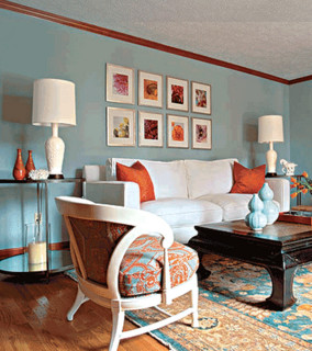
I’ve had this button for a while, planning to use it in a bracelet design. I originally thought of it as a black and silver button, but on closer inspection, was surprised to find subtle blues and oranges, a combination I’ve never worked with before. A search online showed that blue/orange is the most commonly seen complementary pair, its popularity attributed to the fact that blue is “cool” and orange is “full of energy.” There are even websites devoted entirely to the duo. After looking at hundreds of pairings, here are a few of my favorites.
A blue and orange room I could move into tomorrow, bag and baggage.
<
A great tote, a frozen drink, and a vibrant scarf:
I decided that I much prefer brighter blues with orange, and the glow of coral-hued orange to the blood-, brick- or popsicle shades. That decision made, I used black for the base of my bracelet, accented with a subtle coral and a stronger blue that brought out the colors in the button.
I like to wear this bangle in multiples, so I let the coral have more of a presence in the second design, both in the base and the embellishments.
Now all that was needed were some coordinating earrings. I turned to Carol Huber Cypher's Mastering Beadwork, and chose the Bountiful Garden Earrings, a combination of brick stitch and a little flower fringe. The button does resemble a flower, after all. Once again, the coral beads took the lead. I punched them up with a brighter pink coral not seen in the bangles. (The bangle design is Tamara Scott's Circle of Gems, which gets its texture from embellished netting. I never tire of making these!)
3/5/10
Vanishing Treasures
I could become seriously addicted to wireworking if I could put my beads down long enough. Swirling wire around a mandrel can be just as meditative as hours lost to peyote or herringbone. This sterling silver wrapped cabachon is a beautiful dark amazonite, accented with paler stones, hollow silver beads, and freshwater pearls. These stones were a real find, normally much too expensive, but acquired from Bead Happy’s recent going out of business sale.
Although not a regular customer (Bead Happy catered to stringers, not beadweavers), I hate to see this small, independent bead store close its doors. Normally, my quest for beads takes me an hour’s drive north through Atlanta traffic, but if I was embarking on a stringing project, or just looking for loose beads, I would take the back roads south, (where every house had an awning, and yard signs promised fresh brown eggs or free puppies to good homes), to the small town of Carrollton, and the historic town square Bead Happy called home. The owner, Jackie Smith, was never too busy to cite the history of the stones I was interested in and offer spot on creative advice.
As I drive through the streets of my town, it’s sad to see all the empty storefronts. Even our local Barnes and Noble will be closing its doors later this spring. Both stores are closing because their buildings went into foreclosure, seriously impacting my ability to linger (okay, loiter!) over beads and books, my two passions. Yes, I can always stock up on both by purchasing online, but I usually find myself willing to pay a little more for the experience of walking the aisles, and browsing the stacks or taking the beads over to the window to appreciate their color. With each store lost, we’re losing a piece of our community.
3/3/10
Spinner Rims...Reimagined
Who hasn’t been moved (haunted?) by the photos still emerging from Haiti? When I decided to donate my profits from an already scheduled April trunk show to the relief effort, I wanted to find an earring design to communicate my new theme. Virginia Jensen’s Spinner Rims from the October 2009 issue of Bead and Button immediately came to mind. They’re dynamic, expressive, and the combination of cabochon, cube beads, three colors of 15 seed beads, and delicas suggests forward movement— just what I was looking for - my Hope for Haiti earrings! I contacted Virginia, and she graciously gave me permission to feature and sell her design at the show.
The pattern is a unique variation of herringbone stitch finished with tubular peyote. (Virginia's design has really broadened the way I think of herringbone. And cube beads.) The finished earrings glow with optimism in any color palette I dream up. I wore an aloe green and chocolate brown pair on a visit to my favorite Atlanta bead store last month, and the staff at the counter went crazy over them – even sent another employee off to search for their Bead and Button back issues so they could stitch up their own. I’ve made nearly two dozen pair and have posted some of my favorite color combinations below.