12/5/14

Farewell, Radiant Orchid

A little bit brown, a touch red, Marsala is my favorite color from Pantone’s Spring 2015 Color Report, so I was beyond thrilled to see it named Color of the Year in the WSJ this week.


“It has an organic and a sophisticated air,” says Leatrice Eiseman, executive director of the Pantone Color Institute, Pantone’s color advisory group. If that brings to mind farm-to-table cuisine, bushy-but-coiffed beards and urban dwellers’ growing obsession with farm life, that is exactly the cultural phenomenon that Pantone—and the design world—are addressing here.”

Organic and sophisticated. Precisely how I felt about this color the first time I saw it. The day the color was announced, my Cyber Monday order of zircon rondelles in dark cognac appeared in the mailbox – and they look to be a good match for Marsala. Can’t wait to pair them with Aquamarine.


So, while wreaths, pinecones and garland make their annual appearance throughout the rest of the house, it’s beginning to look a lot like Spring on my bead table!

11/24/14

Art Bead Scene November Challenge

One of the highlights of my month is clicking over to the Art Bead Scene blog and checking out the entries inspired by that month’s art challenge. It’s been awhile since I’ve been able to participate, but who could resist the great fall colors in Martin Johnson Heade’s tropical landscape?

"Cattelya Orchid and Three Hummingbirds," color palette created by Brandi Hussey

I had the palette in mind on a trip to Austin earlier this month. A visit to my sister-in-law, Kathy, always includes a foray to local bead stores and I know I quite literally gasped out loud when I stepped into the charmingly named Lapis Lane Beads and discovered a strand of Nora Pero’s  polymer clay petals.  They perfectly captured the painting’s richest pinks. Focal beads found!

Deciding on a freeform, double spiral necklace, I began my design by creating a bead soup of the darker, muted colors on the right side of Brandi’s palette.


Wanting lots of texture to represent the lush forest, I included seed beads ranging from size 11’s through size 5’s, in matte, metallic and Picasso finishes. I tossed in some chunky rondelles, keishi pearls and black gold-plated copper nuggets and my soup was ready. My rope uses only the darker colors in Brandi’s palette until the center section, which bursts into pinks, amethyst, and deep gold, and, of course, those gorgeous petals.


I’ve made double spiral necklaces before, and while I love their organic look, they can prove to be a bit fussy to wear. Even stored in its own box, the larger, graduated loops that form the bottom of the design can flip over the smaller loops that form the base.  I don’t know how hectic your mornings are, but by the time I reach for an accessory, I’m already running late. There’s never time to sort out the loops, so I never wear the necklace. With this design, I incorporated some chain, woven into the base beads and the beads of each small top loop. Problem solved. The chain adds structure, and those bottom loops stay perfectly in place on their journey into and out of my jewelry drawer. It even spilled out ready-to-wear from my travel bag! This necklace I am definitely going to wear a lot!


To see more jewelry and art beads designed around this month’s painting, be sure to visit the ArtBeadScene blog on November 30th and follow the link-ups.

11/3/14

Big Show, Small Pieces

“Nothing is particularly hard if you divide it into small pieces.” I took that great advice from Henry Ford as my motto in preparing for my first-ever art show last weekend.

I aimed for a simple, streamlined booth, with contemporary displays, business cards and packaging.

I limited my offerings to three collections: botanical-themed lariats and earrings in Fall blues and burgundies; 100 earrings made the first 100 days of this year with proceeds to be donated to Doctors Without Borders; and one-of-a-kind necklaces grouped in Fall Brilliants and Neutrals.

My best decision was to enlist my sister, Janet, to work my booth with me! I would not have made it through the busy periods without her at the ready to record sales, make change and hand customers their perfectly wrapped packages. And she wore pink! (I read an article post-show citing statistics that booth attendance goes up significantly if you welcome your customers into your booth wearing any shade of pink.)

Making my financial goal for the show was a big win. But even more valuable was being able to connect with customers face to face, getting their feedback on my products, and testing out new design ideas. (My lariats were a hit, but my Clio earrings? They garnered no interest at all!)

Another amazing aspect of the show was the personal interaction with other artists on my aisle. What a talented group they were.
 
Jenny Pfanenstiel of Forme Millinery was exhibiting her one-of-a-kind couture hats in the booth right across from mine.

Justin Keibler, of Baz and Bea, exhibited his boutique's collection of classic and trendy custom-dyed ponchos and dresses. 

Gina Hirsch, Designer at July Moon, is an art show veteran who definitely knows great ways to create
height and visual interest. How cute are those repurposed men's dress shirts?

The question I was asked most often (by customers and other exhibitors) was how they could find me online. As this blog is my only online presence, I’m going to have to address those questions pronto. Deep breath. One small piece at a time. I’m starting today with this free Facebook Marketing course from Creative Live. Join me?

10/14/14

Clio Earrings

My designs have been mainly one of a kind, but for my first time exhibiting in an Art Show later this month, I wanted to create a collection, a grouping that, although not identical, shared strong commonality. After creating a series of lariats, a theme developed – Modern Botanical – and 3mm rondelles quickly emerged as my signature design element. 

But how to use them in earrings?  Stacking them in mini-chunks, and dangling them in clusters made for great pairings with my lariats, but I also needed to find a way to use them in stand-alone statement earrings.
 
Calliope Earrings by Fusion Beads
I found this Calliope design among Fusion Bead’s Inspiration Projects, and stitched it up to see how it would translate in my more restrained color palette.


Although I liked the result very much in these autumn neutrals, I felt the flat circle and picot edging were out of synch with the rest of my collection.  Modifications were in order!


Switching out the flat circle component with a larger round wire component allowed me to keep the same diameter, but lose the fringe. My rondelles were a little smaller than the ones Fusion Beads used in their design, and I found that stacking mine gave me a more pronounced negative space. I was going for a flower, but ended up with a stellate (our botanical word of the day, meaning star-shaped). Still within my Modern Botanical theme! Since the original version was named after the Greek Goddess Calliope, I named mine in honor of her more practical sister, Clio.


As I created them in lots of colors, I documented the steps in my journal. Although I could stitch them in my sleep right now, this will head off that moment of design panic if someone asks for one six months from now!


My favorite colorway this season is still the awesome combination of Bright Cobalt, Royal Blue and Aluminum.

10/2/14

The Best New Tool on My Bead Table

I’ve been keeping written journals since I got my first diary for my 9th birthday. I started keeping a visual design journal last year when I won this sketchbook from Kathleen Lange Klik of Modern Nature Studio.

In addition to my own rudimentary design sketches, that first journal holds design ideas I came across (or went searching for), simple collages of colors and shapes I found intriguing (and wanted to find a way to translate into beads), and page after page of visual to-do lists (which I became addicted to creating after reading Liza Kirwin’s book, Lists.)
 
Janice Lowry’s visual to-do list, from Lists, by Liza Kirwin.

I had a decision to make this summer when the pages of that first sketchbook were nearly full and it was time to move on to another one. Intrigued by a recent exhibit I visited on book arts, I decided to sign up for Deryn Mentock’s Artisan Daybook online class and create one myself from vintage book covers and drawing, printmaking and watercolor papers.


Deryn shared so many design techniques in this class – altering cabinet cards, creating wire forms and collaging were just a few we used on the cover.


I found my cabinet card tucked away in a shoebox in an antique store. I loved the fact that the girl was in profile, and just look at that hand muff! The photography studio imprint shows the photo was taken in Cincinnati, and the inscription on the back reads, in impeccable penmanship, “A Merry Christmas from Sister Clara, 1890.” Could Clara have ever envisioned another woman, 125 years later, giving her portrait a second life with watercolors and layers of stampings?


Sari silk and a piece of tatting given to me by my husband’s grandmother nearly 30 years ago are wire wrapped around sticks from my backyard. Isn’t that the cutest flower? I have a feeling these wire forms Deryn taught us will be finding their way into my jewelry pieces!


The pages of my first sketchbook were filled up chronologically. I can still flip to a particular design pretty easily - amazing how our designs are like offspring and we can remember them in birth order! But for my new journal, I created individual signatures for notes, earrings, bracelets, neckwear and color ideas.


The first section in my journal will be for gathering colors and patterns into palettes. Deryn’s class included several fun transfer 
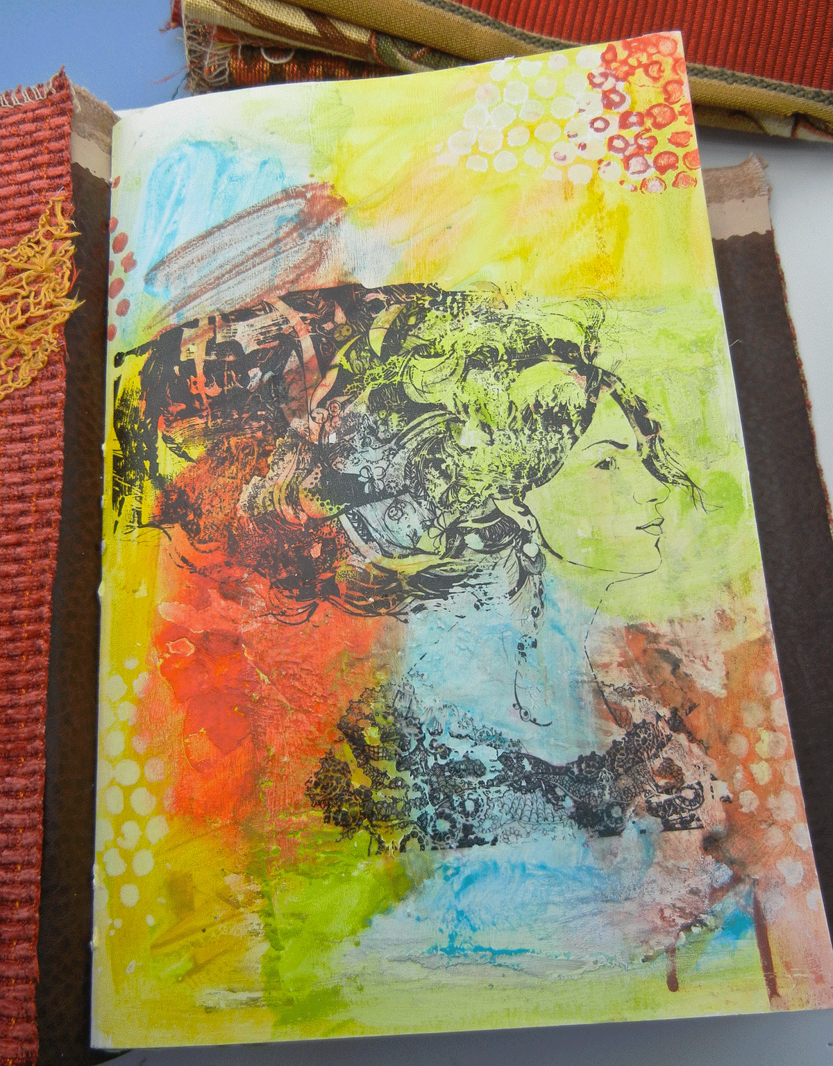
techniques. For the cover of my first signature, I printed an avatar of my Dream Client onto a transparency and transferred her onto a watercolor and gelato background. The only art supplies I had at the beginning of this project were a beautiful set of colored pencils Kathleen gifted me with my original sketchbook. I became a frequenter of the $3 and $5 sales tables at my local Sam Flax art store!


The workshop gave us lots of techniques to make the inside pages as unique and interesting as our covers.  Adding a small envelope with tissue tape gave me a good place to capture artist cards from our recent trip to the Arts District in Asheville.


A collaged envelope is the final signature in my journal. Empty when this photo was taken, it’s now stitched into the spine and brimming with ideas I need to transfer onto the pages of my journal!


I highly recommend putting Deryn Mentock’s class schedule on your watch list. Deryn’s joy and enthusiasm for the creative process are infectious, and this workshop, besides being totally fun and inspiring, was the highlight of my summer sabbatical.