3/30/11

BTW-The Power of Three

So much to explore in Margie Deeb’s color theory classes on craftedu.com. This week I played around with the triad color scheme to see if I could put together some compelling shades that I don’t normally find in my jewelry box, which is fast becoming a jewelry drawer!

This chandelier earring is a typical triadic color palette, using three colors equally spaced around the color wheel: blue-green chrysocolla rounds, purple and orange-yellow seed beads and a luscious mango quartz drop. I think you’ll agree it offers strong visual contrast and rich, vibrant colors. (The design is Louise Smith’s Charlottesville Chandelier from The Best of Step by Step Beads.)
I instantly felt more comfortable designing this complementary triad – starting with the complementary pair, aqua green and red. Then I added yellow, the color midway between my complements on the color wheel. I let the greens dominate this palette, and used the red and yellow for accents. Still pretty vibrant, even though I used less saturated versions of my hues. They'll bring a fresh twist to just about every green in my spring closet!
While the earrings are definitely fun statement pieces, I will reach more often for this still-triad, but closer-to-analogous bracelet. More subtle, this modified triadic palette is created by choosing colors that are separated by only a space on the color wheel – purple, blue and aqua. I love the pop of the bright aqua with the darker, more subdued blue and purple. (The design is a variation of Smadar Grossman’s Cube Delight bracelet from the October 2010 Bead & Button, substituting tila beads for the cubes.) It will be the perfect accessory to dress up capris and a tee this summer. It's Bead Table Wednesday! Take a minute to click the BTW button on the right to see what other bead enthusiasts are up to this week.

3/23/11

BTW - Celebrating Jane Eyre...

Who was, herself, a beader it seems…


I wish to think only of the work I have in my hands, to see only the silver beads and silk threads that lie in my lap.


I revisited Jane Eyre in preparation for the latest remake of the movie, due in my city this week-end. The book packs a passionate punch, no matter the age of the reader. I first read Jane Eyre in high school (didn’t we all?), again in my 30’s, and just closed the cover on my third reading last night.


The above quote is from a pivotal point in the novel, when Rochester returns home to Thornfield Hall from a lengthy absence, and should surely be included in the movie version. You can bet I’ll be searching the scene for Jane’s beads!


To celebrate the moment, I’m finishing this ornate brooch. The design, one of Cynthia Rutledge’s, predates Jane’s time a bit, but still, in the book, the female characters’ shoulders are bare and necklines are unadorned, with the brooch appearing as a wardrobe mainstay.

Fast forward to this fashion season, and designers seem to again be making a big deal out of this small accessory!

It's Bead Table Wednesday! Click the link to the right to see what other folks are thinking about and working on.

3/21/11

Red and Navy

My sister-in-law requested a necklace. A navy necklace, with pops of bright red and blue. Since we live 400 miles apart, I sent her a link to Interweave’s e-patterns to give me an idea of what style she had in mind, and was not a bit surprised that she chose Shelley Nybakke’s Egyptian collar.


The design is elegant: right angle weave rectangles that transform from silky fabric to structural domes as layers are added. The original design uses metal seed beads embellished with cornerless cubes, which I’ll replace with firepolished beads or crystals. The rectangles are connected with graduated loops of beads. The hard part was locating navy seed beads. Finding none in my local bead stores, I ordered samples online, but the sheer intensity and range of navy made it difficult to choose just one. So I stitched up sample components in three shades for Jennifer to choose.


Shades of navy, from left: metallic navy, navy lustre and dark blue lustre.

While I’m waiting for her decision, enjoy this sampling of red on navy from Etsy.

3/20/11

Adventure in Freeform

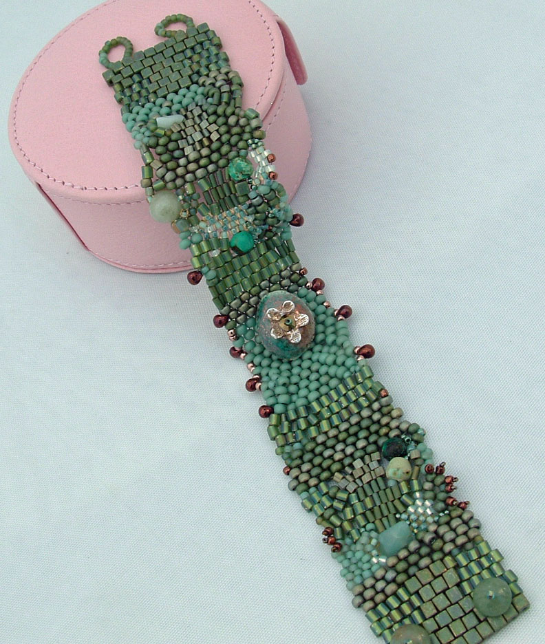
All manner of shapes, sizes and shades of green went into this freeform peyote bracelet. Along with a dose of courage. I’m not a spur-of-the-moment, off-the-cuff person. I use a recipe to make egg salad! I’ve long been attracted to freeform peyote, twice signing up for a class, only to find both cancelled at the last minute. So I set off to investigate this technique on my own. No recipe.

The finished bracelet looks nothing like the version I had in my mind, but it was fun to spend a day learning my way around curves, ruffles, and bridges. As I tied the final knot, I realized the afternoon had flown by and Dan’s plane was landing at Hartsfield. Deciding to take the bracelet apart, I nevertheless clamped it on my wrist, testing out the closure, which was a design element I liked and would keep if it proved reliable, and headed to the fish market to pick out dinner.

As I was pointing out the salmon fillet I wanted, the oldest of a trio of sisters also standing at the counter noticed my bracelet and asked if I made it. She then yelled to her mother, halfway across the store, “Mom, come look at this lady’s bracelet!” Several bystanders leaned in to take a peek (it was, after all, the busy dinner hour), and I was mortified. All this attention was being paid to a piece that was not my typical style and certainly not a standout in my portfolio! The Mom, who owns a boutique, quickly extracted my beading history, handed me her card and extended an invitation to bring some of my summer pieces by for a look.


Once home, I set the cuff back on my bead table, still determined to cut, pull and rip it apart, when Dan, who rarely visits my workspace, pronounced it “artistic.” So, in the space of a few hours, my freeform creation has gone from a design that didn’t work to beads with a backstory!

3/16/11

Bead Table Wednesday - Soft Spring Colors

 
This week I am going to be experimenting with free form peyote. Since Sunday is the first day of spring, I'm celebrating winter’s end with soft colors, starting with these lichen seed beads – one of the newest bead soups from Beverly Ash Gilbert - an intriguing blue-green-grey, full of shadows and highlights

I found some additional pieces to mix in from my stash – I can play up the grey with the kambala stone pendant, veer toward violet with the chunky strand of fluorite, or flow into an analogous palette using the silver and ceramic clasp. I’m thinking aqua blue and turquoise!

3/10/11

Color Challenge - Analogous Complementary


How to create a color scheme for a neckstrap for this gorgeous lampworked focal? I determined that the main colors in the bead are the complementary pair, purple and yellow green. The artist took advantage of a broad spectrum of the color wheel to include analogous colors from fuchsia to aqua. There was already plenty of excitement and lots of hue contrast in the focal itself. Literally thousands of possibilities!

If I were wrapping this around my own conservative neck, I would have picked out the classic blues (I see blue violet, steel blue and tints of cerulean in the focal) but for this necklace, I wanted to challenge myself to push beyond my personal inclinations, which trend towards the traditional and trustworthy.


So I chose two colors from the bead’s background swirls that I don’t normally work with, vibrant red violet and deep aqua green to create the neckstrap. I kept the aquas to the muted, dark shades, achieving contrast by using different finishes and bead sizes. Red violet is seen in the kumihimo strip and as accents in the spans of aqua green.


I think it’s the perfect accessory for the middle of March – the not exactly winter, not quite yet spring necklace.

3/9/11

Bead Table Wednesday - Violet and Aqua

This morning finds me in the middle of a necklace project: a glass teardrop pendant suspended from a strip of kumihimo-woven triangle beads, and test strands using button pearls, fire polished rounds, seed beads and sterling silver. So, although it's a bleak and rainy winter day outside, it's springtime at the bead table!


3/2/11

Bead Table Wednesday


I’ve been considering neck strap designs for this beautiful silver and gemstone pendant (acquired last year before the price of silver started capturing headlines), and have finally found one I think will work. Elegant and understated were my key requirements because I want the focal to really stand out. I’m keeping the main beads in the red-violet family and am hoping the gold-lined beige AB delicas will bring a little warmth to the piece without being too bright. Check back – I hope to have the rope finished by the end of this week!